If you’re familiar with the evolution of personal computers over the past three decades, then it could be easy to take for granted the menu bar in Apple’s OS X operating system (OS).

When sitting in front of a Mac, the menu bar is right there, at the top of the screen, where it’s always been, with the Apple logo sitting in the same position for nearly 30 years! While the functions available on this menu have changed with time, the menu bar is still a central design component of Apple’s computer operating system. Instead of putting menu options within the window of each application, the menu bar serves as the hub for all application features, as well as global system features.
In contrast, Microsoft Windows hasn’t quite figured out where to put global system features. If you notice in the title of this article I said “Windows taskbar,” well, because there hasn’t been a definitive central location for OS settings during the lifespan of Windows, so I had to pick something to compare to the Menu Bar in OS X. For much of the past two decades, Windows users accessed a “Start” menu located on the bottom left of the screen as part of the taskbar. Of course, no such taskbar existed prior to Windows 95.
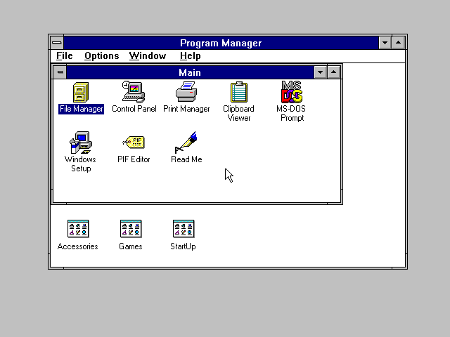
So, are core system functions in the “Main” menu of the “Program Manager” as it was in Windows 3.1?
Or how about in the “Start” menu, which debuted with Windows 95?
And then of course the Start menu itself morphed and changed its appearance over the years until Windows 8, when Microsoft decided to kill the Start menu in favor of…well, let’s just say the jury is still out on that one.
But it sure looks pretty!
While Windows has been widely inconsistent in placement of core system settings and functions, the Microsoft operating system has been quite consistent in placement of in-application functions. Application settings and functions always appear in menu form at the top of each application window. Although Microsoft did decide to screw up the idea of a simple, clear and concise menu by introducing the “Ribbon” menu concept.
So which OS got it right? I don’t think there is a right or wrong, but there’s something to be said about Apple’s ability to make an OS in 2013 feel new, while still keeping the overall appearance similar to that of the first Macintosh released during the Reagan administration.
So what are your thoughts? Do you like Apple’s consistency with the menu bar, or do you think Microsoft has the right idea in trying to kill the floating static menu in favor of multi-touch gestures, as they have done in Windows 8? Of course, Microsoft appears set to bring back the Start menu for an encore in the upcoming Windows 8.1.


